
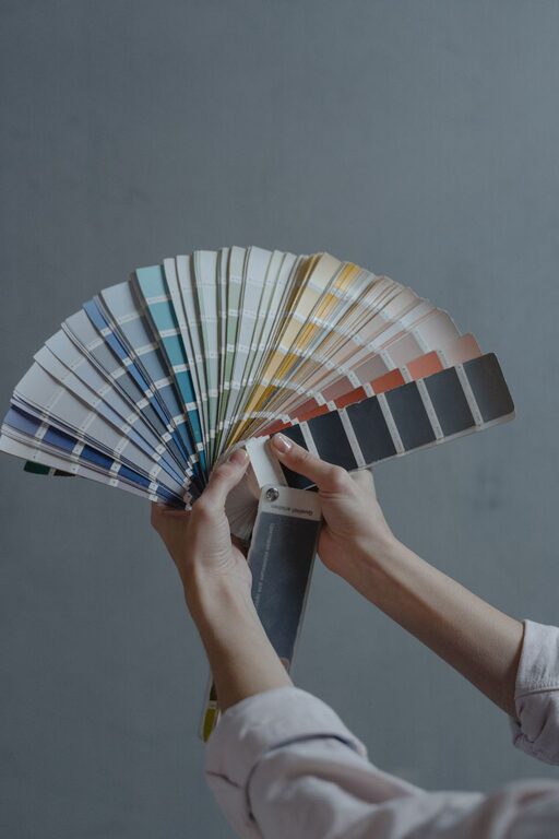
Creating a peaceful and inviting atmosphere at home often starts with choosing the right colors. Calm colors can help reduce stress, promote relaxation, and make your space feel more welcoming. Whether you are redecorating a single room or your entire home, selecting soothing hues can set the tone for a comfortable environment.
In this post, we’ll explore helpful tips for choosing calm colors that work well in various spaces. From understanding the psychology of color to practical advice for mixing and matching, these guidelines will help you create a home that feels calm and balanced.
Why Choose Calm Colors?
Calm colors are typically soft, muted, or neutral tones that evoke a sense of tranquility. These colors help to:
– Reduce visual clutter and overstimulation
– Create a harmonious space ideal for relaxation or focus
– Complement natural elements and lighting
– Encourage a restful environment, especially in bedrooms and living rooms
Common examples of calm colors include soft blues, pale greens, gentle grays, and warm neutrals like beige or taupe.
Tips for Selecting Calm Colors
1. Consider the Purpose of Each Room
Different rooms serve different functions, and the right calm color can enhance that purpose.
– Bedrooms: Choose soft blues, lavender, or light greens to promote restful sleep.
– Living Rooms: Warm neutrals or muted earth tones create a cozy gathering space.
– Bathrooms: Light blues and pale greens can make the space feel fresh and serene.
– Home Offices: Soft grays or subtle greens help maintain focus without distraction.
2. Understand Color Psychology
Colors can influence mood. Here are a few calm colors and their effects:
– Blue: Often associated with calmness, trust, and stability.
– Green: Represents nature, balance, and renewal.
– Lavender: A gentle hue linked to relaxation and creativity.
– Gray: Neutral and sophisticated, promotes calm without feeling cold.
– Beige and Warm Neutrals: Grounding colors that bring warmth and comfort.
Choosing colors with these effects can help tailor your space to suit your needs.
3. Test Colors in Different Lighting
Colors can look very different depending on lighting:
– Natural Light: Colors tend to look truer and more vibrant.
– Artificial Light: Warm light can make colors appear cozier; cool light may make them feel more sterile.
Always test your paint colors in the room at different times of day. Paint sample swatches on the wall and observe how the color changes with light.
4. Use a Calming Color Palette
Combining colors thoughtfully creates a cohesive look. A calming color palette typically includes:
– A primary neutral: For example, soft gray or warm beige.
– One or two accent colors: Like pale blue or sage green.
– Subtle variations in tone: Mixing lighter and slightly darker shades of the same color family adds depth without overwhelming.
This approach keeps the space balanced and easy on the eyes.
5. Incorporate Texture and Natural Elements
Calm colors work beautifully when paired with natural materials and textures:
– Light wood floors or furniture
– Linen or cotton textiles in neutral tones
– Stone or ceramic accents
– Plants for a touch of green and life
These elements complement calm colors and add warmth and interest to a room.
6. Avoid Overly Bright or Highly Saturated Colors
Bright and saturated colors can be energizing but may disrupt the peaceful vibe you want to create. If you love vibrant colors, consider using them sparingly as small accents through pillows, art, or accessories rather than on walls or large surfaces.
7. Consider Your Personal Preferences
Ultimately, the best calm colors are the ones that make you feel comfortable and happy in your space. If you’re drawn to a particular color, find a soft or muted version of it. For example, dusty pink instead of hot pink, or pale teal instead of bright turquoise.
Practical Steps to Choose Your Calm Colors
- **Collect Inspiration:** Use websites, magazines, or apps like Pinterest to find color schemes you like.
- **Create a Mood Board:** Gather paint chips, fabric samples, and photos to see how colors work together.
- **Narrow Your Choices:** Pick a few calm colors that complement each other for your rooms.
- **Sample Paint Swatches:** Test them in your space and observe throughout the day.
- **Finalize and Paint:** Once you’re confident, begin painting and enjoy your tranquil new space.
Final Thoughts
Choosing calm colors for your home is a rewarding way to create a sanctuary where you can relax and recharge. By considering room function, lighting, and your personal style, you can select soothing hues that enhance your living environment. Remember, the goal is to craft a space that feels peaceful and inviting — a true reflection of calm.
With these tips, choosing calm colors becomes an enjoyable step toward a more serene home. Happy decorating!